
I do wonder how deals site Cudo is getting on since they launched in April. The current design of the Cudo site looks very cluttered at the moment. It’s a mess of tabs and icons, and I’m pretty sure sales conversion is not at an optimum level.
With their current advertising spend, Cudo will obviously be looking to maximize return on investment, and I suspect they could double sales conversion simply thru a site redesign – way cheaper than doubling advertising. The good news is, the layout just needs to be improved.
Here I have outlined some areas that could be looked at:
Deal Title
For starters the title of the deal is too small. It dosen’t stand out against any other text. Title is one of the most important elements on the page, and it should catch the eye.
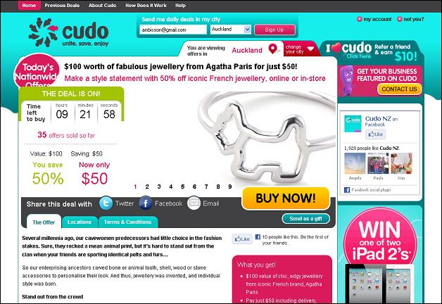
Deal Image
The image of the product is too small. Double the size of the image. Image is usually the first thing people will look at. Also I’m not a fan of sliding images – you’ve looked at the image and you are now reading the text and the page moves, distracting you from reading the damn thing! Very distracting when trying to make an impulse buying decision. Sliding images are fine on homepages for large sites, but not on a single page sites such as deals sites. I say get rid of the changing images.
Pricing area
Check out the pricing area, its unclear which number is the price of the deal, and which number is the amount saved. The font size for the price the same as saving percentage. Everyone is now aware that group buying sites offer at least 50% off RRP, so the discount percentage dosen’t have to be that big.
Buy Now Button
Good colour with the yellow, but I suggest moving it over to the pricing area. It will result in more click thrus.
White space
Effective use of white space is crucial to making designs pleasing to the eye. Cudo have quite a narrow layout and could easily extend it 200 pixels. Spreading everything out would give more room for white space, which will make the key elements not only easier to read, but they will stand out more against the page.
Eye Flow
Each day when I check out 1daysale deals, this is the process I go thru to assess a deal. Most of this is subconscious and I suspect most people will do it this way.
1. Image (What type of deal is this?)
2. Price (Would I spend this amount on this type of deal ?)
3. Title (What exactly is the deal?)
4. RRP (How much am I saving?)
5. Location (How far do I need to travel)
If the elements of the page are jumbled and its hard to find each of these in the right order, the brain fatigues.
Overall Cudo’s current site design is extremely overcrowded and the fonts are too small. Simplicity and clarity is the key for impulse buying sites, you only get one chance each day. Cudo are going to the expense of all this mainstream advertisng on radio and TV but I suspect the site design is losing a lot of sales.
I also suspect due to mainstream media advertising that Cudo has more “oldies” using their site, than other deals sites. As we all know, vision gets impaired as we get older so text in particular should be larger to make it easier to read. If Cudo were to make just one change it should be to make the title a larger font.
Cudo has the buying power, to offer some really good deals. All that is needed is a new layout – Larger fonts, more white space, and an easy to read pricing area. I’m sure the user experience will be greatly improved.
Posted: Thu 30 Jun 2011